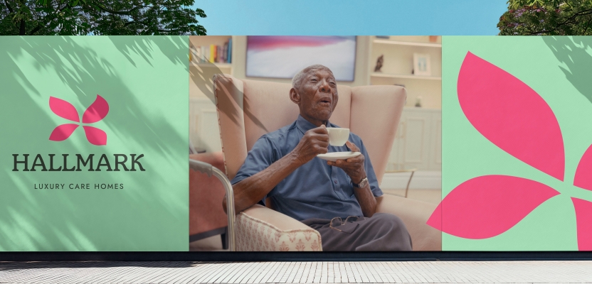

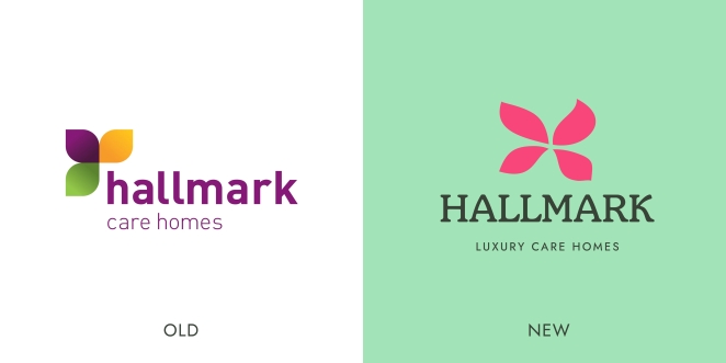
Hallmark Luxury Care Homes, the family-owned group of 22 care homes in England and Wales, relaunches with an all-new brand positioning and identity created by The Corner London. The work sees a complete overhaul of Hallmark’s brand strategy, tone of voice, visual identity and communications across all touch points including website, press, social and branding within the homes.
The decision of moving into a care home is charged with negative emotion and the feeling of finality. This is often perpetuated by the care home category, surrounded by the stigma of ‘God’s waiting room’, either painting a picture of sad, frail, older people who are ‘in need’, or unrealistic, overtly happy residents defying age.
Fighting against the well-established stigmas of what life in care homes is like, Hallmark has modernised its branding and communications and revealed the new brand platform ‘For Every Moment’, positioning itself as the care home that enables residents and their families to thrive in later life.
To learn more, we spoke to The Corner's Head of Design, Andrew Minchin and Head of Account Management, Taya Dufall.
What was the brief for the rebrand?
Hallmark wanted to transform both their brand, and the idea, or experience of what life in a care home is like. As they did so, they wanted to diffuse the negativity around this profoundly important moment, to make the move into a Hallmark care home feel like a positive next step, where residents can continue to live a fulfilling life, rather than what can all too easily be seen as a ‘final step’.
Their brand, and their brand world had not been refreshed for a number of years, so understandably felt dated, not a true representation of who they are, and the experience they offer.
How did the initial pitch/brainstorming phase go?
We reviewed the sector, as you’d expect, saw quite disparate visions of what life in a care home could be like. And also saw something of a disconnect between stated brand visions, or promises, and the reality of the brands themselves. We also visited the homes and spoke to residents and staff to really get under the skin of the Hallmark brand.
We wanted to make sure that whatever we did stayed true to Hallmark’s core, and all the things that make it unique. The best way to understand that was to immerse ourselves in the day to day. It was a really collaborative process, sharing our thinking with the Hallmark team every step of the way.
Describe the purpose of the brand and its target audience
Hallmark offer a wide range of living solutions from Retirement Homes to Dementia and Nursing Care, so we had to be mindful of the different prospective residents and ensure our branding, tone of voice and communications could stretch for the different care categories.
At its core, Hallmark believe everyone can thrive in later life. That will of course look very different for different people, but no matter what, Hallmark will be there for every moment - big or small, helping you get the best out of life.
What was your thinking behind the rebranding solution?
The way we see care homes isn't always rosy. Some people call them 'God's waiting room,' and that name alone brings up some bleak images. It's like there's this idea that everyone there is struggling and in constant need of assistance. However, after visiting a number of Hallmark homes for ourselves, and witnessing the vibrant atmosphere they foster, it became evident that Hallmark’s residents experience genuine joy, and continue to thrive in this stage in their life.
We were inspired by both their purpose (“we believe everyone can thrive in later life”) and the nature of the experience they provide, the strong sense of community and vitality, all of which we aimed to capture in the rebranding process.
Did you learn anything new during the project?
From a sector perspective, there is a big job to be done of changing people’s perceptions, and making the conversation about moving into a care home a little easier. We felt the category is failing to address this, currently. It tends to depict later life as either a lonely, frail existence, or as an overtly happy, smiling, ’everything’s great’ experience. Neither are the true reality.
What exists in between these two opposites is something more nuanced, sensitive and important. That’s what we have tried to capture. From a cultural perspecitve, the media is (often quite rightly) full of horror stories about care homes; stories that understandably make people fearful of moving into a home. Our work won’t solve the bigger issue, but we hope it is a step in the right direction.
What was the biggest challenge? How did you overcome it?
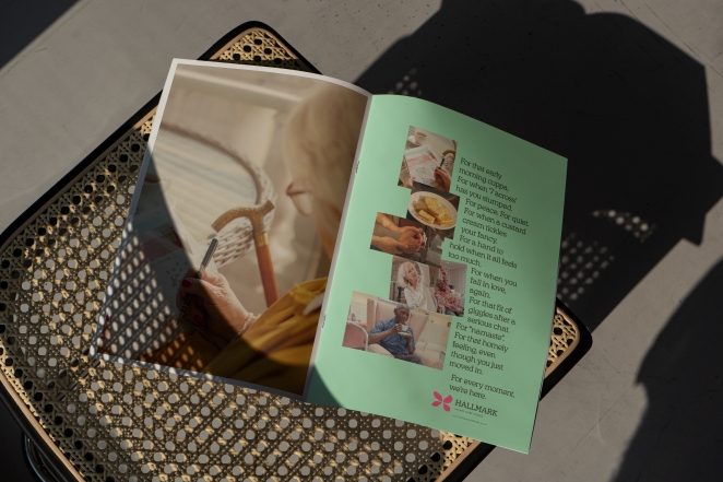
I think the biggest challenge was capturing the more nuanced middle ground we mentioned in the last answer. To create a new ‘third way’ in the sector, which was positive, but also real; that offered something better, but at the same time felt authentic. As we did this, we wanted to convey a sense of quality, even luxury, but also didn’t want Hallmark to feel like an austere, corporate hotel brand, with no heart or soul.
We overcame this by working hard to understand what Hallmark’s resident valued, in their experience; and also where their staff saw the magic, in their residents’ everyday responses. Then capturing this in a fresh, uplifting, but warm and gentle brand promise, and colour palette. Ultimately, we wanted Hallmark brand to convey a sense of positive, human energy, to feel alive.
What kit/tools/software were used to create it?
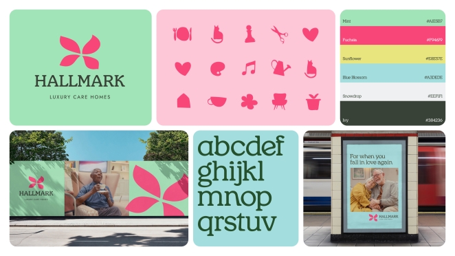
A majority of the design work was produced with the Adobe CC suite, including Illustrator, InDesign, Photoshop and After Effects. The iconography was hand drawn on the iPad with Apple Pencil to create an organic feel, then taken into illustrator to finish off.
What details are you most proud of any why?
We particularly like the iconography and what they represent, inspiring residents to partake in all of the different activities that are on offer in the homes. From meeting up with friends in the bar for cocktails, playing a game of chess or heading down to the beauty salon for a haircut.
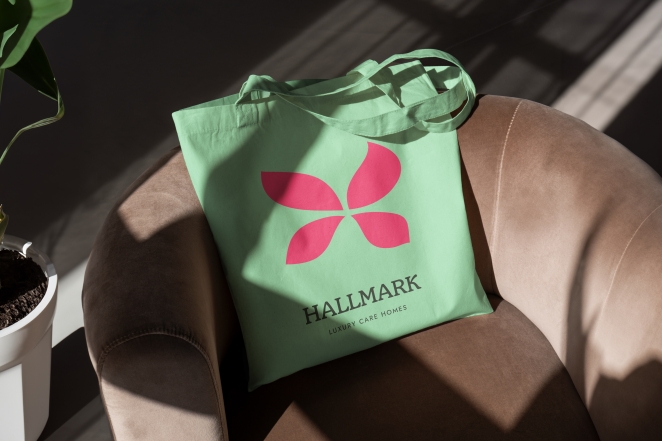
There are icons for all of Hallmarks facilities and it is embedded into the brand identity. Our talented in-house designer Ben Potts lent his skills for these and the flower which ended up being the symbol in the final logo.
What visual influences fuelled your solution?
We were inspired by the works of Henri Mattise, his bold emotive shapes and vibrant use of colour had the expressive qualities that we were trying to convey. Additionally, our mood boards were filled with spring imagery, which influenced our fresh and bright colour palette.
What do you hope it achieves for the brand?
As a society we don’t really ‘do’ old age, and conversations about later life and moving into a care home are often avoided, until it’s too late to make an informed decision.
We hope that the rebrand and supporting comms help to build a better picture of care homes and helps Hallmark to stand out from the category, in turn inspiring people to broach the conversation sooner.
What would you do differently if you could do it over again?
We did some exploration into some more elaborate illustrations which could showcase the individual homes in more detail and capture them in a charming and unique way. It would have been nice to add them to the mix - but hopefully we will get to do that soon!
Credit list for the work?
Tom Ewart - Founder & ECD
Andrew Minchin - Head of Design
Ben Potts - Designer
Taya Dufall - Head of Account Management
Tom Ayling - Senior Producer
Grace Cheah - Art Director
Conrad Jones - Copywriter
Sam Huckle - Art Director
Josh Baggott - Copywriter
Emma Batho - Strategy